LAUREN LOUISE DESIGN

HONORING THE PAST, BUILDING YOUR FUTURE

Our First Home

ON THE BOARDS: MY GUEST BEDROOM

On The Boards, Our First HomeLauren BraudComment
OTBGuestBedTitle.jpg

My heart and prayers go out to everyone affected by this pandemic. I hope that my blog can provide a place of lighthearted respite from the sickness, the worry, the home schooling and the stress. I am deeply grateful for those on the frontlines and to those staying home in hopes that they can to lessen the impact of this virus on our community. As a small business myself, I am thankful that you’re here, reading, and hope that you find something in this that entertains your soul if only for a moment.

Lets call this “Designing: Quarantine edition”. Our guest room has been many things since we moved in two years ago, guest room not being one of them (see this post on our little first home). This room has stored boxes of childhood memorabilia, a shocking amount of unopened mail, off-season clothes from our small master closet, endless amounts of old paper work I haven’t had time to deal with, etc etc. Well at this point, 30 or so days into staying at home, it seems I have finally had enough.

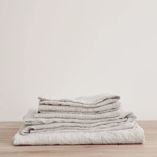
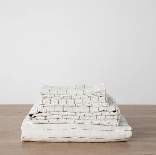
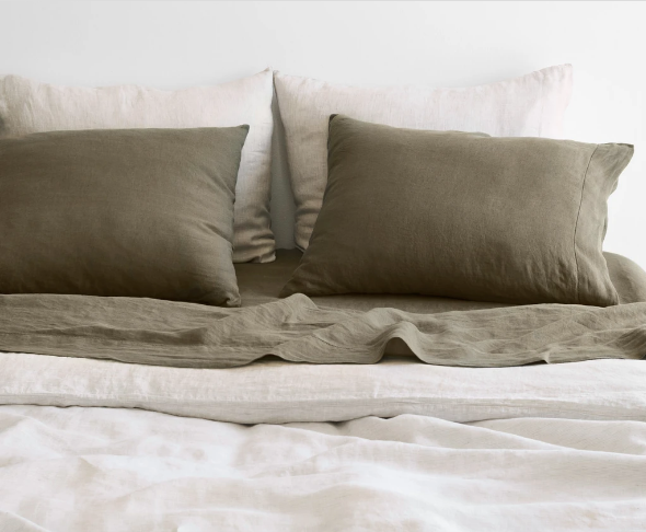
When the pandemic looked like it was going to hit in full, I decided we better order a mattress topper in case one of us gets sick and needs to sleep comfortably in a separate room. What happened next I often refer to with design clients as “if you give a mouse a cookie” syndrome. Well… the topper meant the fitted sheet didn’t fit so I had to get new sheets, and new sheets led to new pillows, and suddenly I have a new side table and I’m throwing some plug in sconces in a shopping cart. Folks I’m now in deep.

We live in a fairly small home by modern standards. At just 1250 SF we don’t have a ton of storage, and while I’ve been using some of my downtime to sort and organize and purge all the things we have been storing, one can only pare down so much and we just need more storage. You’ll see in the plan below that by getting rid of the door to the sad little closet and adding two wardrobe units in its place we will double the original closed storage we had this this room and I will finally have the window seat of my dreams!

I like the bed I have in there now, it’s a hand me down metal bed - but very modern with it’s soft grey powdercoated metal tubes. (This bed from Schoolhouse is the most similar I’ve found online). We will keep it for now but down the line I think I will want something a little warmer with a more defined headboard that can actually be seen over my obscene collection of throw pillows. Once my freestanding clothes rack is gone and all the clothes can be put away in the wardrobes I will have room for some seating at the end of the bed. Our house came with neutral berber wall-to-wall carpeting that isn’t the worst. If the right rug presented itself I wouldn’t be opposed to layering but for now I’m keeping it simple. The side table just arrived from Target (it was from Studio McGee’s Collection with Target) and it is even better looking in person, forewarning: the whitewash finish goes a little gray - I think it’s perfect but it does appear more warm in photos.

Cozy and warm guest bedroom design by Texas Interiors firm Lauren Louise Design .jpg

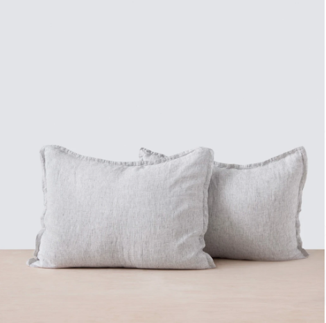
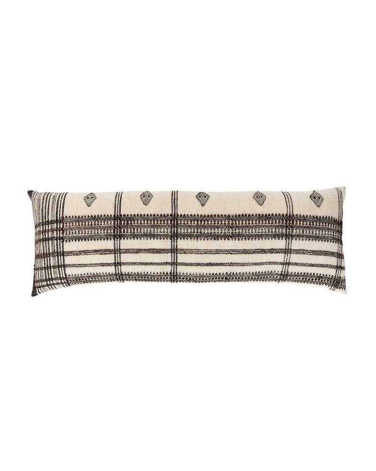
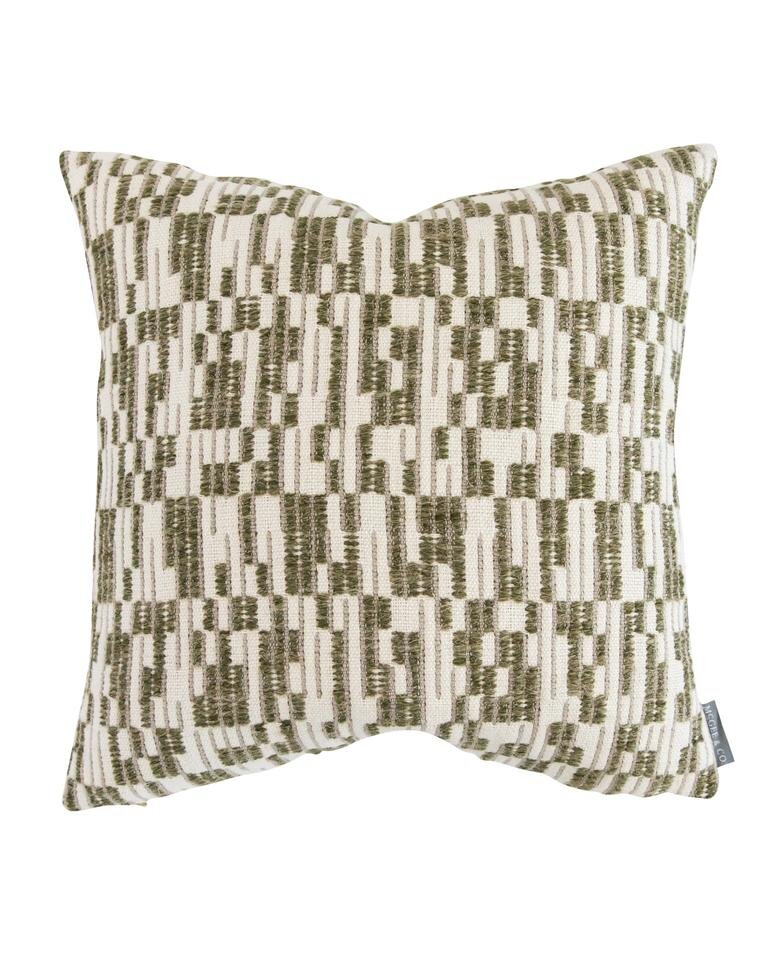
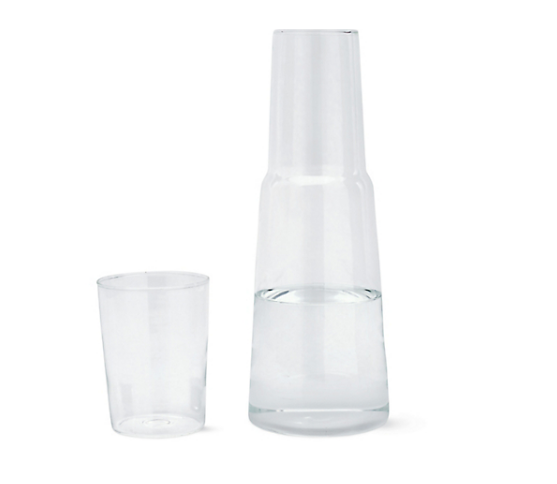
1 - My favorite ceiling fan | 2 - Offset Stripe Pillow | 3 - Batik Lumbar Pillow | 4 - 24x36 Oversized Birch Wood Frame | 5 - Coastline Print | 6 - Classic Gray by Benjamin Moore | 7 - My dream bedside sconces | 8 - The perfect minimal side table | 9 - End of bed benches | 10 - Water carafe | 11 - Plaid pillow | 12 - Cabinet Pulls | 13 - IKEA Pax Wardrobes

The guest room has been deemed our “quarantine project” and one of the two major things we want to accomplish inside our house this year, the second being our laundry room (remember this post, lol my priorities are constantly changing)- again to add more storage! Honestly I’m most excited about the little window bench seat. I’ll probably have the cushion made but I can’t wait to layer it with unique pillows and a pretty natural shade on the window.

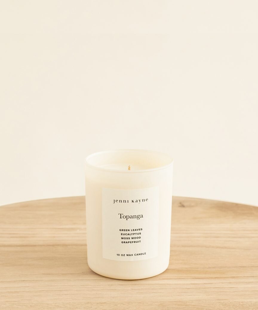
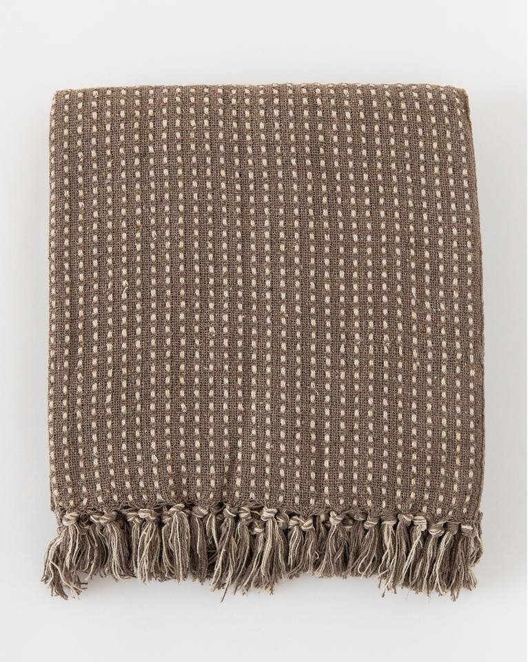
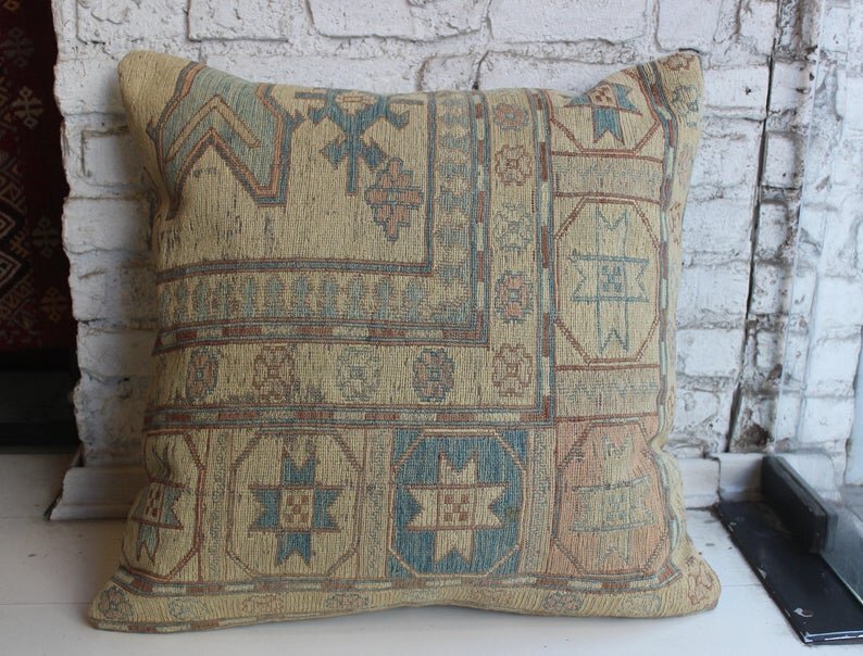
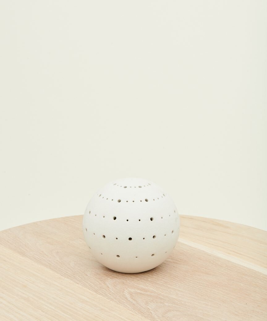
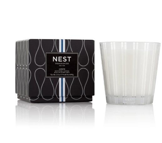
SHOP GUEST BEDROOM ESSENTIALS

Have you felt the itch to tackle home projects since you’ve been stuck inside? I would love to know what spaces you’re struggling with and anytime you feel like it’s all too much for one person to handle (or that your newly minted position as full time cook/home school teacher/work from home worker is more than enough thank you very much) don’t hesitate to reach out, I would be happy to get the ball rolling for you!


This post may contain affiliate links. This means I may make a small commission if you end up purchasing, at no extra cost to you. Please read my disclosure for more info.
6 PROJECTS FOR THE LAST 6 MONTHS OF 2019

Our First HomeLauren BraudComment
6before2020Title.jpg

This post contains affiliate links. Please read my disclosure for more info.

The halfway mark is here folks. At the beginning of the year I wrote a draft of a blog post I never published titled “20 PROJECTS BEFORE 2020” Lofty indeed. Needless to say given the way the year has been going things around my house have been on hold in favor of client projects and growing my business and slipping in a little life-enjoying in between. However, when I posted my home tour (see it and pictures of all the spaces below here) I got several requests asking what smaller things I will be doing (especially to my kitchen) to make me love my house more as we save up for larger renovations. With each item on this list I’ve included some of the items we’re considering adding and my favorite tools for accomplishing the task at hand just in case you have some of your own projects you want to finish up!

1. FRESHEN UP & ADD STORAGE TO THE LAUNDRY ROOM

I’m looking for easy, not-too-expensive solutions to update our laundry room. I imagine it as more of a butlers pantry where we could also store countertop appliances, our wine fridge, and serving dishes. This would free up more space in our kitchen helping that feel a little less hectic and clearing off our counters. I’m even considering stacking our washer dryer so we can gain some much needed counter space. All of this would require some demo of existing (useless) shelving, paint, some IKEA cabinets, and a butcher block counter. A bigger project would be replacing the double doors into the laundry room with something like this, or taking out the wall entirely turning it more into a “nook” than a room - allowing for more elbowroom in the hallway to the backyard.

S H O P T H I S P R O J E C T


2. New KITCHEN BACKSPLASH

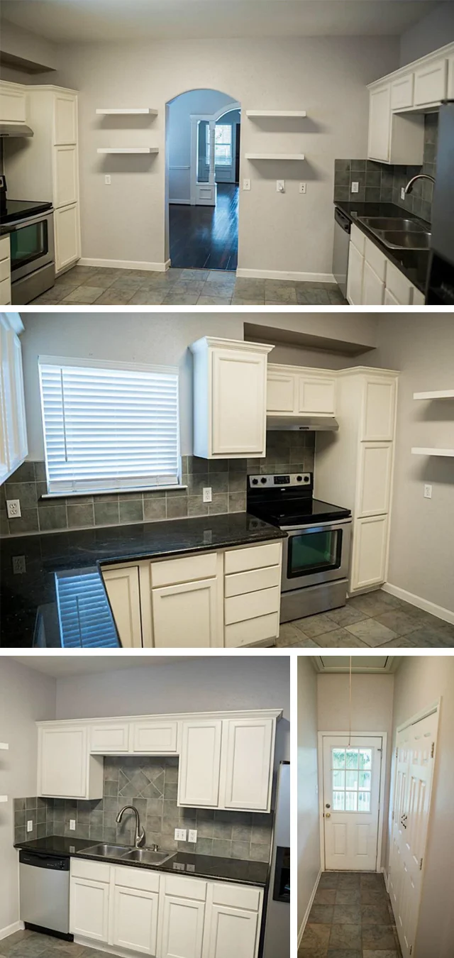
Right now our kitchen backsplash is….dull. Its a matte, slate look, 6x6 tile that was poorly installed over what appears to be the original backsplash (yes, TWO layers of tile). The grout is crumbling so there is a constant coating of grit on the counters. Its a mess. Luckily my mom is a WIZ with tile and it would be easy enough to rip it all out and put in some fresh white subway tile. This isn’t my forever backsplash so I’m looking for something I can love for 3-5 years (but nice enough that if we sell before we get to the full reno, it improves our house value). A white backsplash would help bounce light around our little one-window kitchen.

S H O P T H I S P R O J E C T


3. hang a new dining chandelier

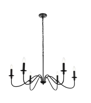
Right now we have a horrific semi-flush straight out of the early 2000’s. It barely gives off any light and is honestly depressing, if a light fixture can be called depressing. We’ve been talking about remedying this from day one. The lights below are all being considered…I’m so ready to replace it but I guess we have to decide on a chandelier first.

S H O P T H I S P R O J E C T


4. remove chair rail in dining room and paint

I have not done much drywall patching in my life. I’m particularly scared of this item bc it could look HORRIBLE. However I have been considering board and batton wainscotting in this room so if I really do mess it up…I will just cover it up. The current trim work in this house is horrific. It’s mismatched throughout, it’s over the top, and it’s like an assualt on your eyes. This is a 1915 craftsman people, get out of here with these 1995 turned columns and fluted trim. Yuck.

S H O P T H I S P R O J E C T


5. Paint the master bedroom and bathroom

After the ultimate success of the brighter white in my guest bathroom it’s time to tackle my bedroom. I would even consider painting our bathroom vanities (currently a dark, matte charcoal - which sounds pretty in theory but is heavy and overbearing in reality). If I get really crazy I might try to replace the cabinet doors and drawer faces too. They, too, were victims of the flippers obsession with aggressive trim carpentry.
S H O P T H I S P R O J E C T


6. Seal all exterior holes and screen in under the house

Last but not least a not-fun, but necessary maintenance issue I’ve been putting off. We recently had an exterminator out to deal with some critters in our attic. He informed us that because our house is a balloon frame we have openings under the house that extend all the way up our walls into our attic and that if we don’t seal those off he can never guarantee that we won’t keep getting critters. Oh and he also isn’t the guy to seal off the holes. Cool. So we’re on the hunt for someone to come put some galvanized mesh around the interior perimeter of all our walls under our house. While we’re at it I’m going to go around the outside perimeter with foam sealant and caulk and close up every little hole I can find. Water and bugs you are not welcome here!

S H O P T H I S P R O J E C T


BONUS!

I’ve already done a little work in our powder/guest bath - mostly “good enough for now” projects like a new mirror and hardware, a fresh coat of paint. I’m on the fence about ordering a new light fixture but if we could really revamp this bathroom by the end of the year: *praise hands*. If we cant gut it just yet I would love to experiment and test some of my hand(wo)man skills: painting the tile floor, putting a feather concrete finish over the existing countertop, and replacing the toilet and sink faucet.

OUR LITTLE HOME TOUR

Our First Home, Home TourLauren BraudComment
HomeTourTitle.jpg

Life is a funny thing. The older I get the crazier I realize life is. Just two months after P and I got married, we bought a house. This wasn’t a part of the plan. Sure, we had started saving, and sure we spent most of our weekends driving around with Houston’s real estate app on our phones seeing what was for sale in our dream neighborhoods, but here we were, November 15th, 2017 - a month after our wedding and we were presented with a house we couldn’t pass up: zoned to a great school, juuuuust in our pricepoint, a yard, our favorite neighborhood, three bedrooms, two bathrooms, etc. It was even just the right amount of fixed up - fixed up enough to live in, but it sure has a slew of projects I want to tackle. AKA: not so fixed up I would feel bad ripping out the “new”.

Whenever I start a new project I walkthrough the project with my client and create a list of EH-VER-Y-THING. You might hear this referred to as the job scope, but when we make this first list we make sure we get every little dream down: every doorknob to change, every wall to move, every rug they want to buy. Budget, shmudget. From that point we’ll look at what they feel comfortable spending, what they want to (and can) do now and what might be saved for later. So consider this my dream job scope (and so I don’t become a broken record - all doors, hardware and lighting needs updating, everywhere):

THE FRONT

FrontofHouse.jpg

She’s a cutie, no denying that. We have a great view from the front porch too - that lot is privately owned but the owner is militant about not selling (we hope for a very very long time). From what little research we’ve done we think our house was built around 1914. We’re in a historic district but we’re considered “non-contributing” meaning little to nothing remains of the original house. Out front it’s pretty much JUST the brick columns you can see in that first image of the porch. Stick around (or zoom ahead, no judgement) to the end and you’ll see an old picture of the house from around 1919. The pipe dream would be to reintroduce some of it’s original character and elements. Other cosmetics: new fence, new paint job, get rid of that fountain (check!), new grass, new planting beds, privacy fence on the side yard. New driveway, new walkway, paint the porch. You know. No big deal (gulp!). I would love a front door that leans a little more traditional bungalow.

Living.jpg

LIVING ROOM

Gosh I have plans for this, but I love this little room. The second I walked in I was like “those built ins need to GO.” But now that they’re styled, I love it. So much storage in the drawers! That wainscot DOES need to go - which is a shame, hoenstly it’s nice but it’s too heavy-handed, and too short for this space! Throughout the house, the current wall texture is best described as “splatter paint”: clumpy, uneven, and aggressive - so someday I would like to skim coat all the walls and smooth it out.

“FRONT” ROOM

This is now our office. I guess the realtor considered it “just another bedroom” so there are no pictures of it before but you can see it through the door there in the living room. The biggest change we made in the house right after we moved was painting the office a DEEP green. It’s also being used as mostly storage still so I can’t wait to share the final product as we get more settled! We really need to get more organized and get rid of clutter otherwise this room will stay the same (though dang I would love to put in a bigger, more “original looking” window).

Dining.jpg

DINING ROOM

This archway. So many people love this archway (including my sweet, wonderful husband). But YALL. I need it gone. This little sweet home was built in 1914 - honestly possibly earlier. This trimwork just. isn’t. right. End of debate, one day soon I will rip it out. Any thing else? Of course. Get rid of the chair rail and change out that dang light fixture. Despite what I perceive as imperfections we have hosted my parents, P’s parents, I’ve had potlucks and girls nights and I love this dining room. It’s the heart of our house. I love gathering people around the dining table and this room is the biggest room in the house with the most incredible light.

Guest.jpg

GUEST ROOM & GUEST BATH

We’ve been here 9 months and we FINALLY have room for a bed! Sure the room is still 84% glorified storage closet (our Christmas tree is in a box in a corner and my wedding dress/winter clothes are taking up about 1/4 of the room…) but minimizing can be a slow process - especially as newlyweds. We had my stuff, P’s stuff, wedding stuff, registry items, and now that we had a home, our parents were DONE storing our childhood stuff too. None the less, I can’t wait to share my thoughts for this room because, again, one of the most exciting things about having this house for me is having loved ones visit.

As for the bathroom, lets just say it photographs well. I keep saying this will be our first big project in the house: a complete gut. New lighting: we only have that one overhead light), new tub (the current tub is so so shallow I dream of the day we can put in a restored vintage clawfoot). The toilet is TEENSY. The travertine counter grosses me out and the tile job is a joke. Its the one bathroom EVERYONE sees since it acts as a powder room AND the guest bathroom. Plus more storage would be great for cleaning supplies and extra linens.

Master.jpg

MASTER BEDROOM & BATHROOM

Not much to see here folks. I like to keep things minimal in our bedroom. We have since put in a bed, two nightstands and a dresser. For many people (us included) their own bedroom is the last thing to get designed because only they see it. I’ve pinned a few things on my Pinterest boards but nothing has hit me yet. I would love to one day put in two windows that would flank the bed instead of the one behind the bed (yep, thats the only decent head wall).

The master bathroom is a time warp ya’ll. Literally checks every box on the mid-2000’s flip house checklist: Brown color scheme, oil rubbed bronze hardware, neutral 12x12 tiles, granite counters, vessel sinks, glass accent tiles. Check, check, check. However, it’s a big bathroom by historic home standards having been a part of the 8’ addition off the back. You can’t tell but there are actually two vanities in the space, and the toilet has it’s own little room. This bathroom is completely functional until we decide to tackle it. In a perfect world this would come in the form of another 8’ addition ;).

KitchenLaundry.jpg

KITCHEN & LAUNDRY

This kitchen was a HUGE selling point for me. The space is so generous for a house of this era it allows for so much possibility. This would be of course a complete gut job in the future - new layout, new everything and running a gas line. We are considering some small upgrades before then that would make us love it more for now: new lighter backsplash tile to brighten the room, a fresh coat of paint on the cabinets, hardware (I hate the feeling of clawing open my cabinets with my bare hands) a cool temporary island, and getting rid of those dang floating shelves. We have slammed our heads on them TOO MANY times.

The laundry room is behind those double doors in that little hallway. Eventually I would like to open it all up completely and put in french doors to the porch. Until then the laundry room is, again, pretty big! As the other half of the addition off the back, at 8’ x 6’ it’s a huge opportunity for storage. I plan to get some ikea cabinets for now, move the microwave and wine fridge in there to clear up counter space in the kitchen, and just make very efficient use of the room. Adding a fun wall paper is on the mental checklist too!

Backyard.jpg

BACKYARD/PORCH/SIDEYARD

Just like the front, we have a huge covered porch off the back. We have a good size yard and a little storage shed (no garage - typical of this neighborhood). We have no plants in the backyard except for an extremely prolific pecan tree - please send any recipes my way…

P and I love spending time outside so some of my main design focus has been out here. We would love a lounge area/firepit, a dedicated space for a grill and smoker, a large (and preferably expandable) dining table under twinkle lights, and shade tolerant plants galore. Our side yard gets the most sun and this is where I dream of adding a couple raised beds and some citrus trees. I love the idea of having a kitchen garden.


All in all we love our little home and I can’t wait to bring you along on our journey as we fix her up. Now, as promised, here she is when she was brand new:

OriginalHouse1919.jpg

A neighbor gave us this photo along with a letter from one of the original owners dated 1919. In the letter they talk about the “steal” they got the house for at just $3000. Their mortgage was a whopping $35/month and they rented out one of the original two rooms for $15. This photo and the letter are so special to us.