LAUREN LOUISE DESIGN

HONORING THE PAST, BUILDING YOUR FUTURE

Reveal

LLD REVEALS: OVERHAULED HISTORIC

RevealLauren BraudComment
WRKitReveal.jpg

One of my most shared pins, and most requested content is the finished kitchen from this post about it’s design. The time is here folks! I was finally able to get into this kitchen to photograph. I’ll do my best to share sources but if you have any questions I’ll be happy to answer!

Bright white classic kitchen designed by Texas interior designer Lauren Louise Design33.JPG
Bright white classic kitchen designed by Texas interior designer Lauren Louise Design47.JPG

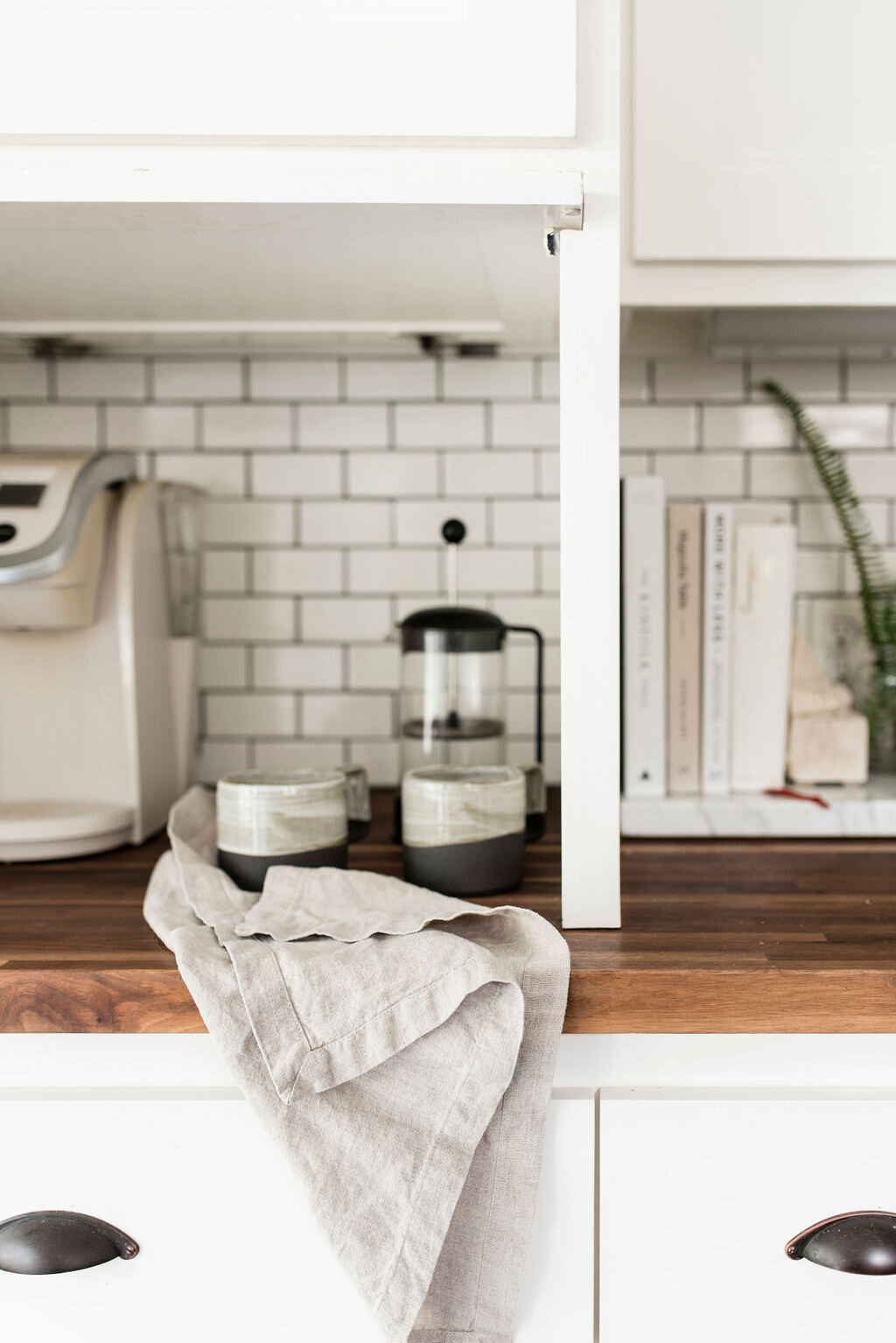
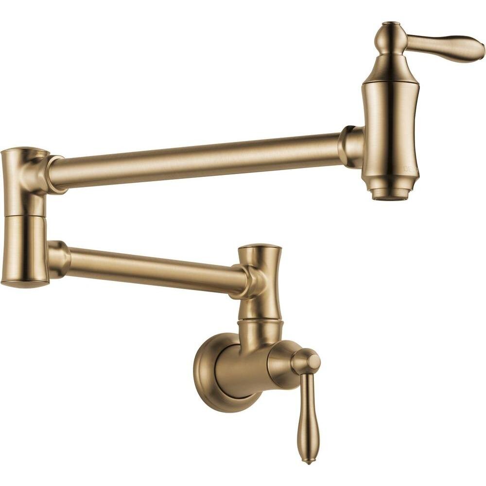
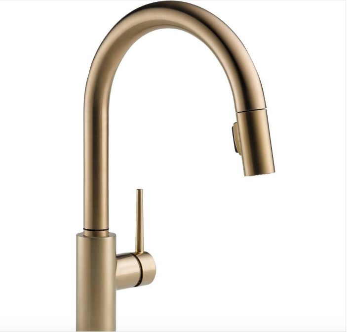
This kitchen was a complete gut - you can see the plans in this earlier post. Absorbing space from the pantry, an adjacent bedroom closet and an enclosed porch we were able to create a beautiful, functional and light-filled space. Large 24”x12” slate-look tiles from Thorntree set the foundation for the design. The faucet and pot-filler are both from Delta in their “Champagne Bronze” finish. The carerra marble island is just over 9’ long and 3’ wide and painted in a contrasting shade of blue-gray. The perimeter countertops are sanded and sealed walnut butcher block. Once a month (or whenever they need a little TLC) the homeowner will wipe down the counters with a food-safe butcherblock oil and no matter their starting condition they look brand new. The exposed brick chimney would have been the flue for the original wood burning stove. We uncovered it during demo and it was such a pretty reminder of the home’s history.

S H O P T H E L O O K

Bright white classic kitchen designed by Texas interior designer Lauren Louise Design6.JPG
Bright white classic kitchen designed by Texas interior designer Lauren Louise Design104.JPG

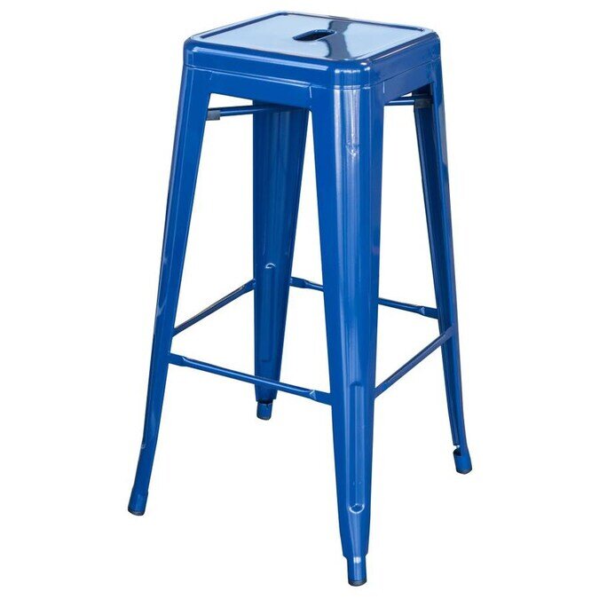
On the west facing wall we removed a pair of windows in order to put in a floor-to-ceiling custom millwork pantry. If I could put pantries like this in all my kitchens I would - at just 16” deep you can see everything no cans of tomatoes getting lost at the back for 3 years. Another of my favorite features of this kitchen is the custom console we built in under the windows. Shallow drawers store linens, extra napkins, and one drawer has note pads and pens - perfect for jotting down a quick grocery list and below that open “crates” store produce and dogfood (in a perfectly sized OXO Container.) The homeowner has a little 5lb Yorkie so the food doesn’t take up too much space! Finally below that a stained, slatted, shelf allows for storing larger bowls and serving platters. Aside from function this entire wall of storage is shallow to allow for a generously sized eat-at island complete with four playfully blue barstools - that are used to access the upper cabinets in a pinch!

S H O P T H E L O O K

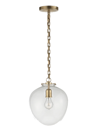
This kitchen was actually mostly completed almost FIVE YEARS ago! Hard to believe because it’s still one of my absolute favorite kitchens! That does mean that a lot of the pieces we used are no longer available (re: the Pottery Barn pendants and the Delta faucet to name a couple) so I did my best to select pieces I would use if I were to design it again today (like these amazing Circa Katie Acorn Pendants!)

Bright white classic kitchen designed by Texas interior designer Lauren Louise Design17.JPG
Bright white classic kitchen designed by Texas interior designer Lauren Louise Design12.JPG

This kitchen is truly the heart of the home. Everyone gathers around the island - it makes the perfect buffet and everyone can be involved, but out of the cook’s way.

This is one of my favorite kitchens I’ve ever designed. See even more images from this shoot with Madeline Harper Photography in my portfolio.

LLD REVEALS: SOFT BLUES FOR BABY BOY

LLDProjects, RevealLauren Braud10 Comments
Baby_Boy_Nursery_Title.jpg

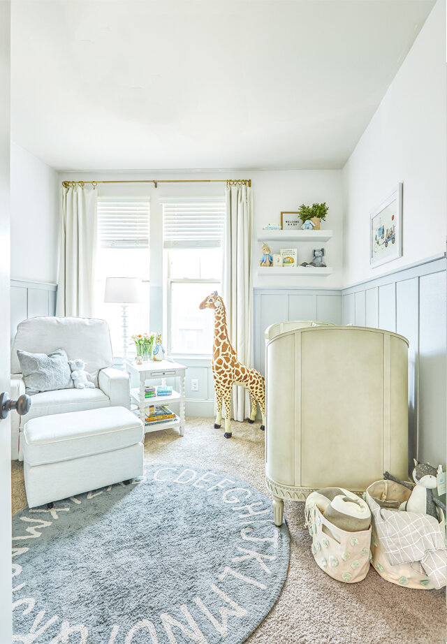
It’s about time! Sweet little baby Pierre was born almost S I X months ago and I think it’s safe to say he’s enjoying this gorgeous nursery (though I hazard to say his mom is enjoying it even more.) If you need a refresher on where we started check out this post on the design.

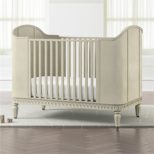
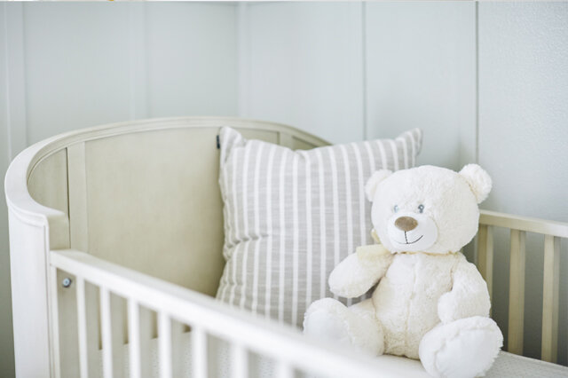
Just a few of the things I love about this room: the light airy colors that provide the perfect calming backdrop to all the baby things, the crib made for a prince, and the board and batton we added that took the room from builder-grade to classic and elevated. Did I mention dad and granddad installed and painted everything themselves?

What I love the most though was this text from mama after her little baby boy was born:

“His room is my calm zone. I love being in there… I’m calm, I’m with the baby. It’s our happy place. It’s the one room in our house that is purposeful and uncluttered.”

I can’t begin to tell you how good that makes me feel, because lets be real for a second, nurseries are really for the parents aren’t they?

Baby blue nursery by Houston interior design firm Lauren Louise Design.jpg

This wasn’t a huge room, we had space for just the basics: a crib, glider, and changing table/dresser. The room already had a great closet and painting the doors out in the trim color made everything look that much more custom. The door to the room swings open adjacent the two closet doors, this worked out so that you can see straight from the master bedroom to the crib.

Blue baby boy nursery by Houston Interior Design firm Lauren Louise Design.jpg
Blue baby boy nursery by houston interior design firm Lauren Louise Design.jpg

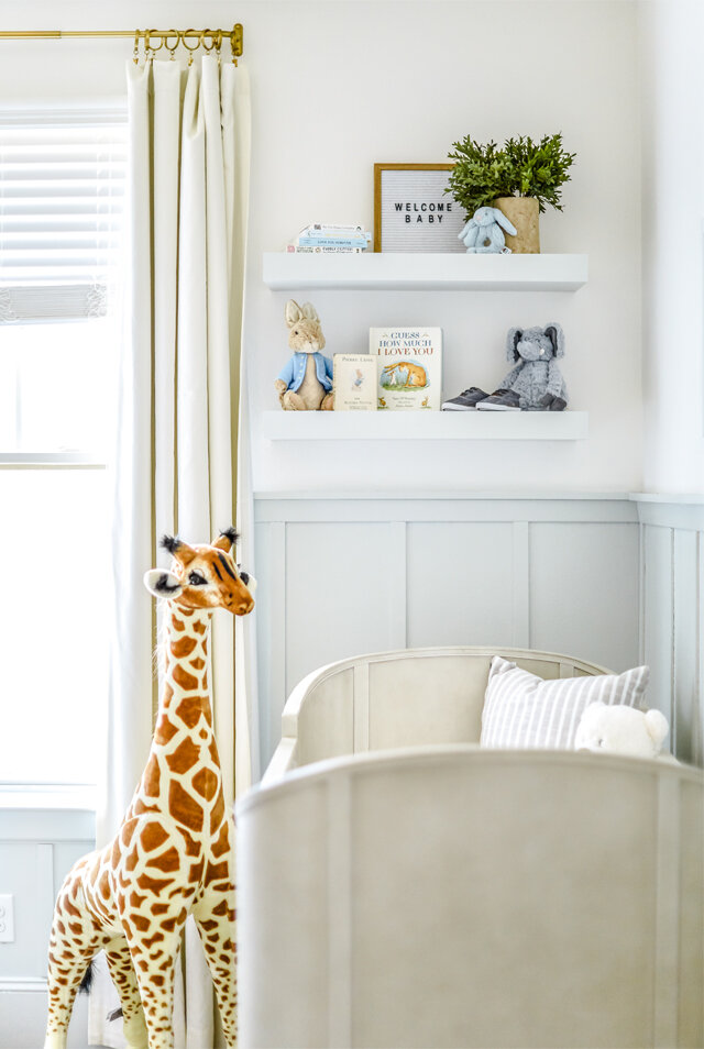
The floating shelves at the end of the crib provide the perfect place for cherished keepsakes and favorite books and allowed for a moment of styling in an otherwise very functional room. The crib is pulled away from the wall, far enough that nothing could fall in or as baby boy gets bigger he won’t be able to reach the shelves and pull things down either. Don’t you LOVE those little shoes?

Blue baby boy nursery filled with books by houston interior design firm lauren louise design.jpg

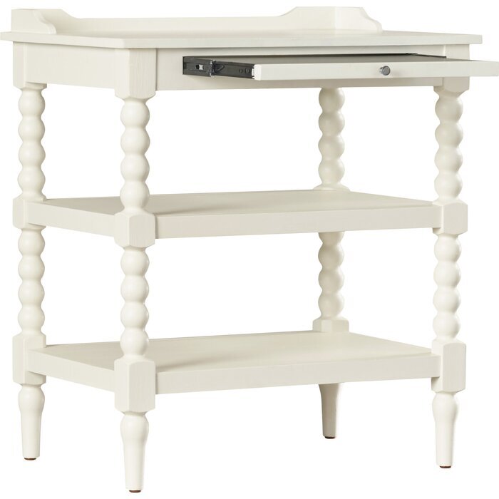
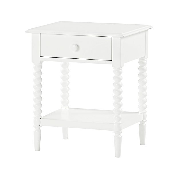
This nightstand has the softest lines and plenty of storage on the two shelves. We paired back the books for the shot but believe me, the book collection is strong (I included a round up of some books and toys at the end of this post)! I love the little pull out at the top of the nightstand perfect for a bottle or coffee mug when the table top inevitably gets full of toys/books/pacifiers/etc. Unfortunately this exact one is now discontinued but I’ve linked a very similar one from Crate and Barrel. This is a table that looks as much at home in this little boy’s nursery as it would be in a future guest room or little girls room; a piece that can grow with this family.

S H O P T H E P O S T

Blue boy nursery by houston interior designer lauren louise design.jpg
Farrow and Ball Blue baby boy nursery by Lauren Louise Design Houston Interior Designer

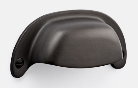
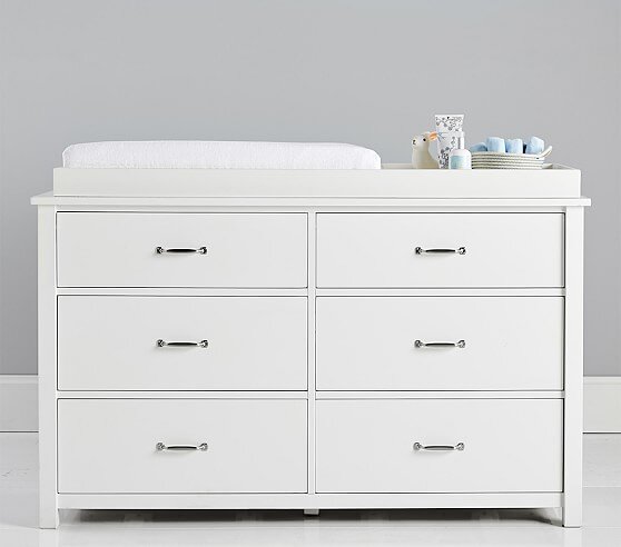
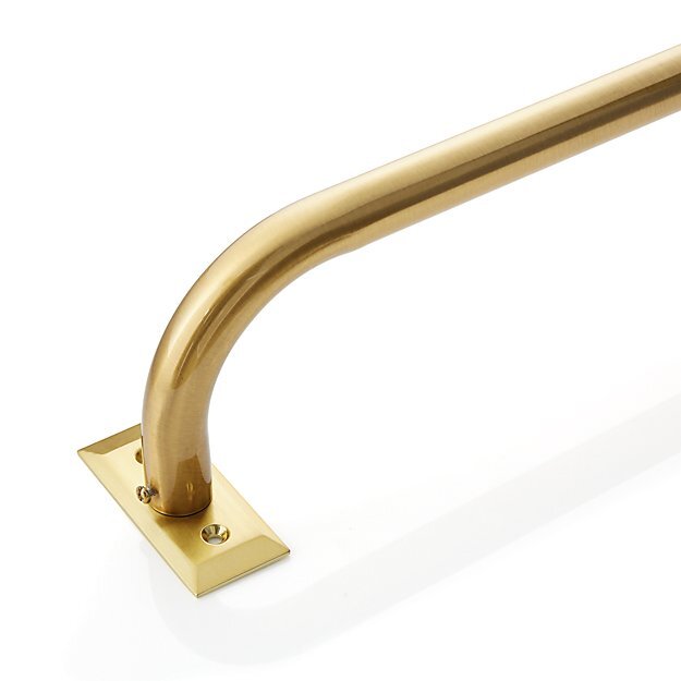
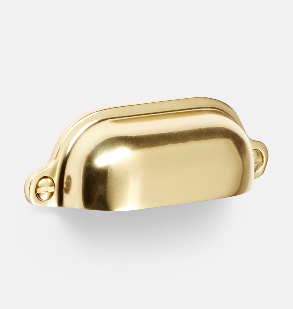
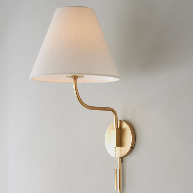
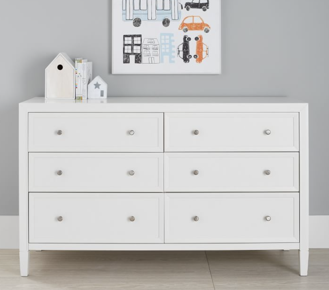
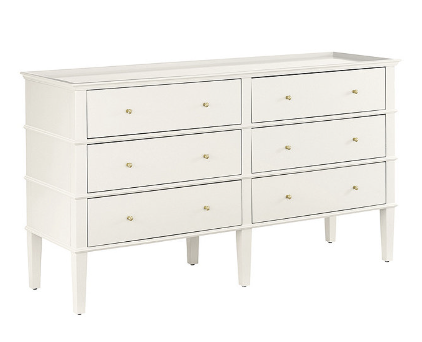
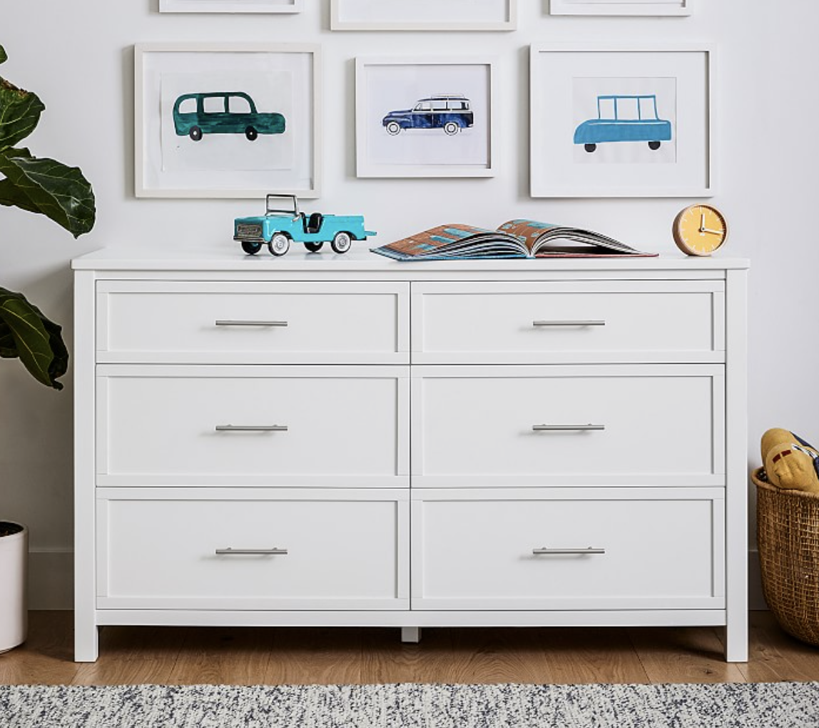
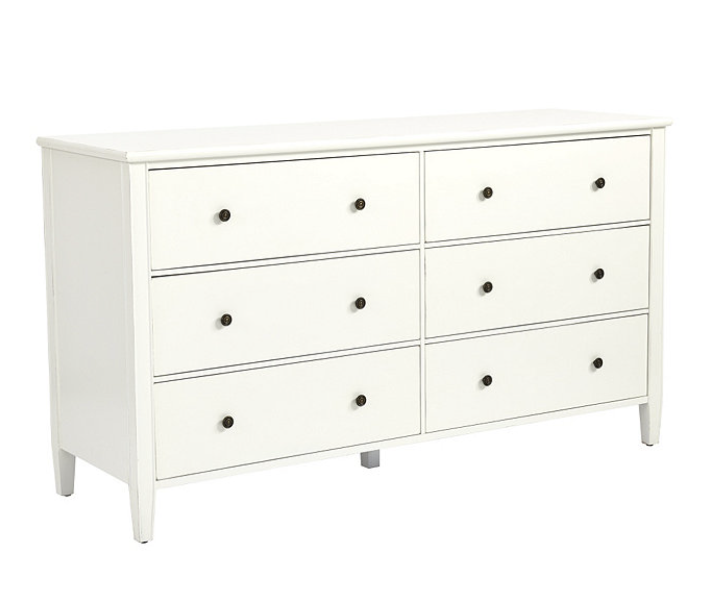
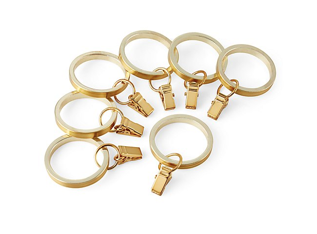
The changing table is between the entry and bathroom door, opposite the window. The dresser was from Pottery Barn Kids, I loved the simple lines and that it’s constructed of FCS certified wood and sealed and painted with non-toxic materials. This is another furniture piece that will grow with the family and could be used anywhere in the house. We did upgrade the hardware to these brass cup pulls to match the curtain hardware and sconce and soften the look a little. Unfortunately this particular dresser has since been retired but see below for some with a similar look. Verify that your changing tray will fit on top. The shaded plug in sconce is perfect for late night diaper changes. And not to be too TMI but the tall wainscoting, painted in Farrow and Ball Pale Powder, is wipeable.

S i m i l a r D r e s s e r s

Baby blue nursery by Houston Interior Designer Lauren Louise Design

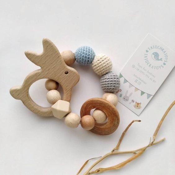
S H O P f o r B a b y

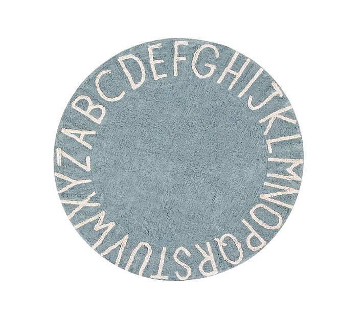
This was easily one of my favorite projects to date, and obviously very close to my heart. My favorite parts are a three-way tie between the wall paneling, the rug and the floating shelves! Whats your favorite part?

Photography by Allyson Huntsman Photography


This post contains affiliate links. This means I may make a small commission if you end up purchasing, at no extra cost to you. Please read my disclosure for more info.

LLD REVEALS: THE BIG TOUR

RevealLauren BraudComment
YogaStudio.jpg

Finally! Here it is y'all: the BIG Studio Tour. I had the honor to work with the lovely ladies of BIG Power Yoga in Houston to help them complete their vision for the second location of their incredible yoga studio. I could not possibly have asked for better clients or more amazing people to collaborate with to bring this dream and vision to life. If y'all will indulge me in a moment of gushy love: BIG Power Yoga is so much more than a yoga studio, it's a community of incredible human beings who have been brought together by a love of getting disgustingly sweaty in close proximity to each other.  What is really moving and humbling is that they then take those lessons of hard-work, compassion, self expression, and perseverance out into the world. I have personally met so many yogis who are going out and changing the very fabric of Houston and redefining what it means to be a Houstonian and a citizen of the earth. I know that may sound a little hippie dippy, but the people who run and attend classes at BIG are the real deal y'all. I feel so lucky to be even a small part of it. AH! Ok! Enough sappy from me! The studio has been alive and kicking for  over three months now and of course I'm just now  getting around to sharing photos of the space so I hope you enjoy!
The first thing you encounter when you walk in is the gorgeous, custom-made front desk (hand crafted by non-other than one of the owners' fiancés! Pure. Talent.) The retail section is up front too, as well as Sandra the fiddle-leaf. Sandra was panic-purchased on opening day and she is magical. Plants, really, are magical. The chair is from Ikea and that fabulous and oh-so-tricky-to-install-but-so-worth-it gold heart is from Urban Walls. 

This is where the magic happens! The Community Studio is one of two large studio spaces, and this one can hold 115 mats!

This is where the magic happens! The Community Studio is one of two large studio spaces, and this one can hold 115 mats!

A MAJOR lesson I learned: take more before photos!!! I was so disappointed looking through and only finding a couple i could use :(

A MAJOR lesson I learned: take more before photos!!! I was so disappointed looking through and only finding a couple i could use :(

Sources | Couches: Jardine Sectional - West Elm, Pillows: H&M and Urban Outfitters, Rugs and Poufs: Ikea, Lighting: West Elm and Color Cord, Custom Mural by Wiley, Reclaimed Wood Counters: Custom

Sources | Couches: Jardine Sectional - West Elm, Pillows: H&M and Urban Outfitters, Rugs and Poufs: Ikea, Lighting: West Elm and Color Cord, Custom Mural by Wiley, Reclaimed Wood Counters: Custom

Heres my favorite part. Thats not true, I don't have a favorite part. That would be like saying "I really love my dog, but I especially love his tail." That makes no sense. What I have noticed though is that if you walk into the studio for the first time and get one of their little mini-tours you will definitely hear something along the lines of "you must see the bathrooms". The women's bathroom is so big BIG could have yoga classes inside it. Its glorious!

Sources | Tile: 1" Hex Matte in Black and White - Daltile , Countertops: Walnut butcher block - Floor Decor, Sinks: White Demi Lav - Kohler, Faucets: Grohe, Sconces: Contour Single Sconce -West Elm

Sources | Tile: 1" Hex Matte in Black and White - Daltile , Countertops: Walnut butcher block - Floor Decor, Sinks: White Demi Lav - Kohler, Faucets: Grohe, Sconces: Contour Single Sconce -West Elm

I sure do hope y'all enjoyed this mini-tour. I am so excited to finally have gotten to share it! If you're in the Houston area you should stop by for a class - best yoga in town! Just visit BIG Power Yoga online to check out the class schedule! To see some more inspiration from the project stop by my pinterest page - you can see more sources from the project as well as images that inspired the looks! Namaste y'all!