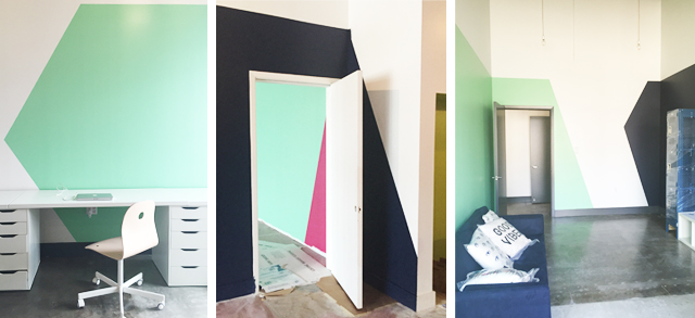
SPRINGTIME COLORBLOCKING
I have been silent for far too long and I can't be kept quiet anymore! I want to talk about color blocking. Ya'll. You're probably seeing it everywhere, accomplished with varying degrees of contrast and ingenuity, and you will soon see it all over the yoga studio (that is so so close to being done I can taste it. Or well, not taste it. I'm sure yoga studios don't taste great....and if a yoga studio DID taste great, this one would. Get excited Houston.) With that being said I thought I'd round up a few of my most favorite examples of color blocking from around the web. When done right color blocking adds instant impact, defines space, and can be so unexpected yet PERFECT. And it's just paint. What I'm trying to say is that it's amazing and you should try it ASAP. (Plus if you stick it out to the end of this post you get a sneak peek of some of the color blocking I've been playing with in the yoga studio....)
Clockwise from top-left: color blocked workspace from Simply Grove, drop shadowing a window via Remodelista , sneak peek-through via IKEA, pop of color on a column - image via Frenchy Fancy
These first images really get my color blocking juices flowing. The first image is BOLD - teal and grey and ceilings and walls and doors, oh my! The teal being painted almost a quarter of the way down the wall gives the impression of extremely grand crown moulding while simultaneously taking full advantage of the already soaring ceilings. Next is the bedroom image. I love me some serious white on white on white, but that pop of yellow is just so much fun, breaks up the room, and plays with your perception of the window as an object. The image from IKEA (love the Kallax units that look like they've had a little toe-kick built out under them). This might not meet a strict definition of color blocking since we're looking through one room and into another, but suddenly the opening in the wall goes from negative space to positive and creates a layered effect similar to painting a big teal rectangle on a wall. The final image shows how color blocking doesn't need to be a wall-only commitment. Painting the column turns it from a functional obstruction in the room to a piece of furniture or art! It plays nicely with the color scheme and is so much fun. We did something similar at Big Memorial and it's one of my favorite moments.
Clockwise from top-left: Drama x1000 via Lonny, some springtime dining via Inside-Out, a focused office from Chez Larsson , this pretty pink bedroom via The Life Creative
I am completely obsessed with the full range of spring hues - childhood tomboy be damned: I love pastels. They're so fresh and surprisingly modern. I think possibly my favorite color blocked room ever is the traditional green one. So bold, so fantastic and yet so livable. I could spend all day everyday in that sun drenched, playful, beautiful room. Purple though, might just be my favorite color (of the moment). A month ago I was seconds away from begging my hairdresser for purple hair exactly this shade. This dining room makes me so happy. White and bright and modern and avocado toast instagrammed everyday. This green workspace on the other hand would really help me focus on keeping this blog consistent - and is great for any of you who may feel a WHOLE wall is too much. Also green is a color known for inspiring innovation (via a great study by my alma mater and past professor) - a great color for all the creatives out there! And finally completing my pastel-trifecta: PINK! When I was little my mom used to tell me that pink rooms caused people to go insane. So what did I do? I painted by bedroom pink (thanks Mom!). And I loved it. And I like to think I'm not insane, but rather well adjusted and happy!
So you made it through to the end of this somewhat wordy post and heres your reward! A Big Memorial sneak peek! Want to see more? If you're in Houston we're scheduled to open THIS week - otherwise stay tuned! As soon as I find a great interior photographer in these parts (or find some faith in my own photographic abilities) I'll post a full, color filled tour!
I know I'm feeling inspired to splash paint on everything! If you could throw some paint up on your empty walls right now which room would you pick and what color would you choose?


